Monday, December 30, 2013

Last post in 2013.

Yet another year has gone, and as usual, we have been celebrating the last week. Our celebration has been going for 5 days and that's enough. Family and friends have been visiting, a lot of cooking and not least eating. Right now I feel like a well filled sausage. 2014 has to include morning walks again.

2013 has offered a lot of magical mornings for me, photographed and filed.


I'm lucky enough to have a view, from our house, to watch the sunrise, and each time I find it beautiful I try to photograph it. Above is a collage of a few of my photos. The colors are so beautiful, and to watch the sky dressed in these colors is truly magic.
I can't see the sunset though, but in the coming year I'll try to catch some sunsets too. Either by driving to the ocean or to climb the mountains.

I wish you all a happy new year, may all your dreams come true!

Sunday, December 15, 2013

Not much painting these days.

Not much creative work at all.

The exception is photographing beautiful sunrises, and yesterday my dinner table chairs got new upolstery. It's a great releaf to have done that. They were used a bit too long and desperately needed to be fixed.


My mother returned home from Spain for Christmas yesterday, so the family is full once more. I'm not quite ready yet, monday will be the the day for polishing all the doorknobs. A hundred years old brass doorknobs need to be polished at least once a year, and Christmas is a very good occation to get it done. It's so beautiful with them shining in all the soft lights.


The gifts are bought, not wrapped. No coocies made, and won't be either. I am the one eating them and I certainly don't need it. Looking forward to a new year with lots of painting and other creative stuff. In the meantime, I'm photographing sunrises.


This is my post # 499, so I just have to write one more in 2013 to round it off, so to speak. I wish you all a merry Christmas, and I'll be back before the end of the year.

Friday, December 6, 2013

Busy days.

I've had alot to catch up after finishing class.

It seems Christmas always comes a month too soon each year. This year my mother returns from Spain and she'll spend Christmas eve with us. I've finally washed the house and everything is ready to start decorating. I have not baught any gifts yet, but I've done all the thinking, so it should be pretty easy to catch up on that too.
Last couple of days we've had a huge storm going, and I heard in the news today several houses had lost their roofs. We've been lucky, this storm came from north west and we don't feel it too much because of a hill. Would have been much worse for us if it came from east.


I made this girl as I tried to draw and paint leaves. I'm happy with the result and it was a good idea to make the background only within the design. I'm not good at backgrounds, and felt this was a great way of doing it. I'm sure I'll do more of this, it's so fun doing them.
Today will be a relaxing day for me, we had some friends over yesterday and I cooked so much onion soup that today will be leftovers.
Enjoy your day too.

Sunday, December 1, 2013

Don't throw away your leftovers.

I did something the other day,


and I want to share the idea with you all. I don't know about you, but when I paint I always keep a sheet of paper to try out my mixed paint before adding it to my painting. Many, many times I've seen some beautiful combinations of color and some great "designs" in these sheets. Now I got the idea to put them to "use". I have this little cutting tool, squared, and I remove the bottom lid to be able to see excactly what I cut. My squares are sized 3.5 by 3.5 cms. and when cut, they actually look like small art pieces. I could have added some details to them, but I want them clean so that the inspiration comes from the colors only.


If I find there are too many white spots on them I'll use the leftover paint on my brush to add in, instead of washing it out in the water. I have glued mine down in my sketchbook, but they can be used in many different ways. As small reminders to a friend, to decorate a postcard or as pure inspiration as I did. And I'm sure there are many more ways to use them too.


I made three rows, so in these two pics you see the same row twice. My nine squares are mostly done using twinks, and they are so pretty. I'm that kind of person that get inspired from colors, so to look at these beauties most often result in new ideas. Also it's possible to discover new color combos this way. I never think of any of this while painting, it just happens and then it's fun to look for the best squares later on. I'm sure I will start a new journal for these squares only, what a beautiful journal that will be when filled.

Just a little idea from me to you.


One day later I found my quote journal and I've written on right pages only. Just as if I was waiting for this idea to show up. Now, my squares are glued in there. Yay! This gives me a lot of inspiration in one journal, both quotes and lovely colors.


Each left side in my journal has room for six pieces, and they are stunning to look at. Below is my latest page, don't they look great? I even held back from painting in all the white and it's just so amazing. My journal has a pocket in it so I save my squares in there until I find it's time to play again.


Oh how fun this is, I can already feel the joy of filling in my journal with these little bits of "leftovers". Amazing to see, can be useful and pure joy when doing it. Can a girl wish for more?

Friday, November 29, 2013

Christmas card made.

I had to make a new drawing for my Christmas card,


because I couldn't come to an agreement with myself. I wasn't pleased on how it turned out, and I found it difficult to find a suitable background for it. Well, that was the first try, now I've made a new one and made it difficult for myself to choose which edition to use.
In addition to my original painting, I did manupilate a couple of extras, and now I can't choose.
My painting is somewhat darker than the pic. below. I imagined the background to be a dark sky, and used a bit different colors. It does look good in person. My intention is to copy as many as I need and glue the copies to cardstock, then I'll add some twinks to the painting to make it look more real. It's still my work, but an easier way to make many of them.


Below is the first one I made using picasa to manipulate. I find it exciting and a bit different from what usually will be used. I like how the colors is muted in a way, it all look so soft and I find it suitable for the design.


The last one is my favorite, but I probably can't use it. It's too dark and I think too difficult to see what it actually is. I did try to lighten it, but out of my printer it's still too dark. Well, I might use it for my facebook friends.


Which one would be your choice?

Wednesday, November 27, 2013

Testing faces.

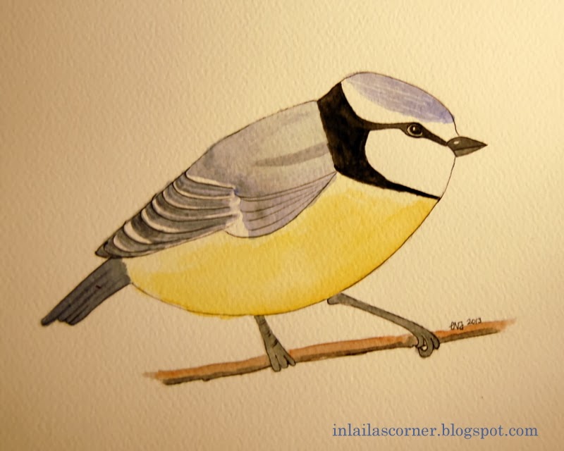
Is it possible to gain a decent result using twinks as medium?


I like doing faces, but have never done any using twinks only. Is it possible for me to do it, and how would the result be? The face I've been testing is a tiny one, it measures 8 by 5.5 cms. I know it's much harder to make a larger one, but for my test I did this small one.

Now, my first pic. shows the face in daylight only. One can't see any signs of the twinks, at least no shimmering spots. Let me just add, it's not done to be a beautiful face, just a 15 minutes from start to end test. The colors I've used are: Oyster, Sunburst, Chiffon Pink, Ocean Wave and Chestnut Brown. In addition I used a watercolor pencil to outline the face. White and black pens too, of course. All the pictures shown are the same face, it does differ a bit because of the angle when photographed. In fact, with some small adjustments, this could become a pretty good face, if I might say so myself.


Next pic. shows the face with an extra lightsource coming from bottom right. Now the twinks shows off, and notice her right eye. Isn't that really something, her eyes acting like normal eyes. Reflecting light in a super way. Remember it's the same face, so without extra lighting it appears as a normal painting.


Last pic. shows the face with light coming from top left. Now, notice the left eye and compare with the others. Isn't it amazing? This last one is a bit wonky because of the angle, but it's not important. The twinks are going to create much fun in the future, and I just have to try a large face to see if I can do that too.


My question was, is it possible to gain a decent result using twinks as medium, the answer is YES it is! This test was so much fun to do, and I'm so pleased to discover how to mix a great face color using my twinks.

Tuesday, November 26, 2013

A little testing.

I was doing a little testing the other day.


The fact is, I'm not good at painting without a good drawing first. I always need to draw an image before I can paint it. I guess it's all about controlling, and I wanted to try without any drawing at all.  I did a very simple sunflower and foliage. Now, I never meant to make this a masterpiece, I just wanted to see if I could achieve any result at all. At this stage it looks like........... well, nothing to put more work into. But, that was the entire point, what result could I gain from a simple painting like this.


I won't claim the result is anything to keep either, but I did learn it's possible to make something without drawing it first, and much can be done to a piece that doesn't look good from the beginning. In fact I've often seen my work change into something not planned and better than I expected. Normally a piece will reach a stage of uglyness before it turns into its final form and I think one has to be aware of that. As you see my final piece isn't much to keep, but it became something far more than what could be expected from a bad start.


I could even put some more work in, to improve it, but I'd seen what I was looking for. It is fun to make these little tests, and useful as well. I did use my twinks on top of this, and the result is a shimmering test piece.

Sunday, November 24, 2013

A little sketching.

I meant to make a post showing my Christmas card for this year,

but I'm not happy with how it turned out so I'll have to work some more on it. Instead I did a little sketching today, I'm planning on making another bouquet with birds in it this time. So to improve my drawing I did draw some birds today, and I see I'll need to practice some more before doing a serious try.


I'm planning on using two or three different birds in my piece, but the one abowe is one of them. Except for the sketching I haven't done much today, just resting and searching the internett. I did sign up for the second class though, and I look forward for it to begin late February 2014.
Coming week I'll have to visit an art shop to fill up with some supplies, my black pens are no good any more, and I want to see what can be bought of different papers too.

Friday, November 22, 2013

Final project in class.

I've done my final project in class

except for a couple of bonus projects. In this final one we were meant to let loose and make a garden scene. I didn't feel for a garden scene but a Spring bouquet which will remind me of the beautiful season to follow winter. I honestly had no idea I could do anything like this. It isn't excactly "to let loose" but I found it more reasonable to paint real flowers. In my head randomly drawn flowers should be that, randomly drawn and nothing else. It's just me and my head.

Below is how it looked like from the start, at this stage I didn't notice how wrong the pot looked. I was planning to add at least a couple of birds to it too.


Below one can see I've added a leafe to hide the wrong pot, not perfect but I can live with that. I also added a tip of a leafe down right to suggest something were happening at the back as well. And finally I add another tulip below the daffodil. I tried to add the birds, but couldn't find them good spaces to be, so I left them out. I will do another try though, and paint wide open tulips with more colors in them, and then I'll add the birds too. I always have trouble to do the background, and I really wanted to leave it as is here, but I didn't.


Below is how it turned out. I'm pleased with my result, but the next one will have a better design. I do see how to do it and will give it a try. Why is it I always see it after finishing a piece?
I'll probably have to pay more attention while drawing.


That's all, it's about time to start preparations for Christmas.

Sunday, November 17, 2013

Done.

I finished my cat the other day,

but I'm not sure it's a cat any more. It does look as a mix of a cat, tiger and teddybear. It was fun painting this and I thought of making an empty fish bowl behind him, but I had no space for that. When I first showed you this cat I had made his eyes wrong, so I had to change place of the black and greenish. That went better than I had believed, even though the greene now is a bit too dark.


What I see now is that the collar should be bending down at the back, not standing up as it does.

I'm in the last week of my online class, and now I'm drawing leaves, curled ones. It's not easy to find a single leaf this time of year, so I'll have to search the net. Otherwise I just imagine how they looks. I'm convinced that anything is possible to draw and paint, it's just about taking the time and be patient. Later on today I'm going to help a friend to mount her curtains, there was something about the rods she didn't understand. Otherwise, we have a beautiful sunny day, not too cold either.
Enjoy yours!

Wednesday, November 13, 2013

Fun in class

It's fun doing this class,


and if you should ever concider taking a class I truly recommend this one. Dion is such a generous teacher, sharing her knowledge and teckniques and she is our main source for inspiration. Mastering Twinks 1. has been nothing but enjoyable for me.

Many students share their works and thereby feed the rest of us with inspiration. I'm so glad I did this, and tomorrow we get the last lesson. One more week to go. One of my latest work is the one below, we should make a piece using three or four colors only. I used four and they were, a bright yellow, a ruby red, a medium violet and a medium green. I'm happy with the result except from the one hat not being centered to the trunk/stem.


Today I started a new painting. Some years ago I saw this image made as an embroidered pillow, and I now want to paint it. I have no cat so I'm not sure how to do it, but I'll probably find some reference on the internet. I'm planing to make him orangy red with some black/grey touches as well.


That's it, now it's dinnertime here.

Thursday, November 7, 2013

Experimenting on my own.

Since I'm learning how to master the Twinks right now,


I'm doing a lot of experimenting on my own. I had this idea of making a painting to look like a glasspainting or Church window if you like. I drew some flowers, and when I had done them as I would like them to be, I just traced them, mirrored them and put them in a way that I liked. At the end I made the stems and leaves. I used a plastic embroidery canvas as template for my circle. The background spaces were made randomly, as I thought it would fit.

I'm especially happy on how the flowers came out, and equally unhappy with the background. It's far too busy, more like a total mess.


My next try was interesting, I changed the color of the flowers and made them a tiny bit different, in the center that is. Well, I copied them, I saw no reason to do all the drawing over again. After all this is all about the colors. Still I'm pleased with the flowers, but this time the background color turned out far to sweet, so I went for experimenting with this piece. First I made all the tiny dots on the blue background, then I stenciled the edge. When the stenciling was done there were stains of color not meant to be there, and to cover it I made randomly "larger" dots of black and went back in making tiny small black dots. That was a great way to hide these small accidents.


I had to do a final one, trying to keep my thoughts strong and focus on what I was doing. Again I changed the color of the flowers, which I now regret, but the background became what I had imagined. Flowers and background do work well together, it's just that I feel the flowers looks a bit too cold.


This was an exciting experiment to do, and I also learnt a lot on using the Twinks. I do like to figure out experiments of my own and this one were useful too.

Tuesday, November 5, 2013

My very first hand carved stamp.

When I was in the US this summer

I bought tools for stamp carving. They have been sitting on my desk, and I have found no inspiration to try carving. Yesterday changed that.

In the online class I'm doing we're experimenting with watercolors (twinks) and stamping. Best stamps to use are those with larger spaces on, not fine lines. The only stamps I have in my stash are fine lined, so I had to make one myself. I'm not much of a stamper but this experiment opened my eyes, and I think it's really fun trying. The ones below are made from fine line stamps. What I have been looking at as mess only, really is part of the beauty of it all. Look at the ones far right, outlined with shade behind. I think they're beautiful.


But, I wanted to try a stamp with larger spaces too, and made my own. I have a lot of beautiful flowered curtains, and found one I liked. It took awhile to draw the image, and I drew it in a much larger scale than the stamp shows. My copy mashine did the downsizing job for me. It's not an easy task to carve out such amount of curved lines on a small stamp, but I did it and I'm very pleased with the result. It was fun trying it, and finding it worked well. I'm sure I'm going to make more stamps, now I'm chasing the perfect images to carve.


I drew and painted the image as well, but I'll tell you more about that later on.

Saturday, November 2, 2013

So much fun in class.

Thare are so much fun work with this class I'm taking,


I almost can't find time bloging or anything else. I have never learnt anything about the use of watercolors, I've just been using them as we did as children, but with a bit more conscious mixing of the colors. In this class we learn a lot about mixing and painting teckniques. There are several chapters in each lesson and very varied exercices following each chapter. It's so much fun, and I've found a "spot" within me that I never knew excisted. One exercice I did was the one below, we were meant to use colors but I got this idea of pears lying on a table with the moon shining on them.


They were a challenge to do, but very fun too. The only thing I would like to be different is the golden glow of the moonshine. As I see it the moonlight is much colder. I tried but that silverish color wouldn't show off.

Another exercice I did was to make a prismatic painting. I was free to make any design, and I woke up one morning with this idea in mind. This sort of painting is so me, I simply love doing them.


The face is drawn using a magazine cut out as reference, I wouldn't spend a lot of time doing one of my own. For me it's more about the lines and color use. There is another one waiting for me at the end of this lesson, and I'm so looking forward to do it. So this is what I'm up to, doing my "homework" and enjoying it.

It's a fantastic journey.........

Saturday, October 26, 2013

Busy with homework.

I've started the class and it's so fun!


We started out learning alot about the twinks and made some mandalas. The last one I made I chose to use simple and few shapes. The mix of using twinks and ordinary watercolors is stunning, The mandala below has a background of "flat" colors, while the mandala itself has twinks. I did a proper job while shading and I'm quite pleased with the result. The paper I'm using helps making a great texture. When I study it now, I see I could have done even a little more shading and gained an even better result. That is, if I did shade in the bottom of the spiderwebs, the whole mandala would have been lifted like half a ball.


I love taking this class, and I get so much energy from it. The other students are very supportive and we share alot of work for each other to see.
Dion is a good teacher and she has developed alot of great material to show off and much to read as well. I truly think this will help me develop in my use of the twinks. And it's a joy to start each day doing some homework.


Today I made my very first still life motif. Some fruits on a table. The bowl is as wonky as can be, but I'm quite pleased with my fruits. The banana was just a mess at first, but I was lucky enough to rescue it. Of course I see several "mistakes", but to be my first it's not bad at all. Right now I'm in my second week, and we'll continue for 5 weeks at all. I should have done this a long time ago, but now I'm glad I'm doing it.

I hope you have interesting days as well!

Wednesday, October 23, 2013

New letter and exciting news.

I'm still making letters, and it becomes more and more fun.

I wouldn't have thought that when I first started. This k is really something of its own. No matter how I tried it wouldn't cooperate. It simply insisted on having shoes, and I can imagine how it will walk away from the rest of the alphabet. How cool it would have been if we had letters like these when we learnt the letters in school. 

Can you imagine the kids, falling in love with their favorite? Perhaps their attention would be too much disturbed by all the colours and fun designs. Well, I'm the largest kid of them all and I love making them.

I have other news to tell you, for a long time I have wanted to take an online course.I have been hesitating because of my lack of technical skills, but now Handyman encouraged me to go for it. I did, and have now signed up for Dion Dior's class: Mastering Twinks 1. How cool is that?!
I'm so excited, I signed in a week after they started but first week is mostly information, and now I'm ready for part two. Can't wait to get started on that one.

I hope you're having exciting days too.

Wednesday, October 16, 2013

More letters.


The final solution of how to make my cards.

 
I've been trying alot of different ways, but landed on this one. To keep the card simple with a touch of the frame. I could have left the frame completely, but I liked it so much that I wanted it to be part of it all. I think this is a great way, I can move  the frame fragment around  to find the best suited spot. That will make the cards different, but still have the same last name. What do you think?
 
 
Otherwise I have start making my letters in a larger scale, A-3 format. The letters have the hight of an A-4 sheet. It gives a larger space to work on with more possibillities. I do see it still might be wise to practice each letter before making the final one. A good idea might not be that good after all. Below I made a background design which turned out not so good. In fact it was much better before all the lines in each square. 
 
 
My g has been enlarged too with a little difference in designs. At first I thought it needed something in the background, but now I'm not sure of that. If it was to be framed, it will work as it is. Clean and clear. What I find  most interesting is to take advantage of the original form of each letter and do something different out of it. The outer lines are never changed though.
 
 
It's a nice work to do and challenging as well. The Norwegian alphabet contains 29 letters so there's alot of work ahead of me. If I should work through both small and capital letters, I have enough work for a year. At least I don't need to be out of ideas for awhile now.
Some days ago I received some new goodies to work with as well. More about that in another post.
Have a joyful day out there!

Sunday, October 13, 2013

S for Sandra.

 Still making letters.

 
This time I made a capital letter, it's made on a A-3 sheet.
I have needed all the experience of trying, now I feel it's easier to decide how to make them. Instead of making a card, this time I chose to make a much larger one and I like it. This S is meant to be a gift for someone I know.
 
 
When the letter was finished I felt it needed something more, so I added alot of swirls which ends as small leaves in gold. The small dots of gold looks great in person, and I think the end result gained on it. The cool thing is that I always see other ways of doing things when one piece is finished, that way I am able to make the same letter several times without them looking the same.


The last photo is just to show you the difference in size. The card was made before I found the best way of doing them. I'll show you that in my next post.
 
We've had the most beautiful weather the last couple of days. Sun and bright skies, lovely!

Friday, October 4, 2013

Cool lettering.


lways trying to find "new" ways.


Wasn't this how they did it way back in time? New ideas keep coming while I'm playing with the letters. This is such a cool work to do, I nearly can't stop. The next letter I got involved with was the g. The size of the cards I'm using is half A-5. The width of A-5 is the hight of my cards. Now, with the g on my table I saw I had a hight "problem" as well. I keep telling myself that these are only tests, but I'm not sure how it will end. The advantage of testing a bit is that I get to see how the designs work together, and not least how the end result will be.


When I first thought of doing this, I had a clear opinion on how they should look. That was before I knew of the width/hight issue. So, when I keep telling myself this is just testing, it mostly depends on how I was thinking from the start. I simply need to adjust my thoughts.
What do you think? Could this do, there's no point in large spaces of emptyness either. With a larger size cards some letters would seem quite small. In some ways I like it when the letter grow out of the frame, it creates a bit more interest to it, I think, just as if the letter live it's own life. I'm pleased with my g, if I should point at anything though, it might seem a bit top heavy. But then again the lower part is flat like a foot holding it up. Well, these are just my thoughts.


This last letter is a good example on seeing how well things work together. The squares in the frame and in the letter are a bit too close, what I think makes it work inspite of that is the diagonal made squares in the letter. I could also, in any case, have lowered the letter a bit more, that would have made it look a bit more interesting and given it more air on top.

The more I look at them now, the more pleased am I using this size of cards. Mediums used are mostly watersoluble crayons, a few markers and black and white pens.
Just by writing this post I have learned something on how I'll make the next one, do you often experience that too? It most certainly has to do with my conciderations while writing.

Two days later and I have found a better solution to the hight/width issue. Coming......

Weekend....... have a good one!

Wednesday, October 2, 2013

Tying and stitching.

My latest mandala.

Even though I've start making letters, I still have some mandalas to make. I wanted this one to look like it's been tied together, like as if I had three different parts loosly tied together. 
 
 
I'm not sure I achieved what I was aiming for, and there's something about the center that disturbs my eyes. One thing is the lack of shadowing, but there is something else as well, something I can't put my finger on. Instead of searching for that, I chose to "stitch" it onto the paper and call it done.
 
 
Somehow this one has the lightsource from top left, and that is unusual for me. Normally I use top right for the lightsource.
I'm enjoying making letters, and in some days I'll share some more with you. It looks like I might have found a good solution for the wide ones, not quite sure yet but it loks promising.
 
I hope you have great times too!

Tuesday, October 1, 2013

Making letters.

This has been on my mind for ages. 

To make my own personal alphabet seems to be what I'm going to do for a while now. The norwegian alphabet contains three more letters compared to the english one, so I had to make my own æ ø å. I believe the english language do have the sounds of our extras though.

Right now I'm in the beginning phase, so I'm not sure how to make them. The a-card is something I did to try out some thoughts. I do have to rethink a bit because some of the letters are much wider than the rest. The w and æ are the widest.
 
It was quite a job to prepare the letters. I cut out letters with a tool, quick cut, draw around them and then go to the copymachine. I enlarged them to 400% of original size.
 I'll probably be testing and planing a bit for a few days.
The other night I couldn't resist ordering some new color pencils, watersoluble, so now I can't wait till they show up. It'll take 2-3 weeks until I'll have them here, so in the meantime I can practice stretching my patience muscle.
What's on your desk this week?

Sunday, September 29, 2013

Sunday ponderings


This week

 has been a week for restoring my complete photo collection. My computer had a brand new hard disc installed, because the original one was broken, and I lost all my photos. I always keep a backup on an external hard disc, so it wasn't a disaster, but I didn't realize how big a job I had done with my photos until I reinstalled them. That made me decide to transfer once a month from now on.
 
 
All the work, to catalog or file them, had to be done over again, and I've had the most enjoyable week diving into all my photos. What hits me the most is this: what an incredible amount of things I've been doing over the last three years, not least, producing photos.
 
This time I've had a real cleanup as well, and it feels good. You know, I'm the kind of person that transfers my photos, use the good ones in my blog, and don't think any more of them at all. That's ok for a week, not for three years I can assure you. Lesson learned! 
 
Even though I had a creative day job, it's not comparable to my creative life now. Earlier I solved "problems" for other people, now on the other hand, I'm free to create in a much wider range. When filing a group called  Paper art, I found, what I still think is, the most intriguing and surprising thing I've made over the last years. It is the end result that surprises me even today. 8 triangles put together holds a perfect circular form, and shows off an accurate square as well. Have a look!    

 
Another file it took me awhile to Complete, is the doll file. I still can feel the satisfaction of how well the dolls photographed, Viva in particular, and I still smile when seeing the photos. I really do appreciate my life as a "home player", and I truly wish that alot more people could have the same opportunety.
 
 
In my garden file, I found the photos used in this post, it seems I have a real soft spot for delicate fragile flowers. Foliage is another thing I find interesting, perhaps I should make a file on all the different foliage in our garden as well.
Thanks for stopping by!